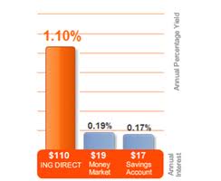
Yesterday, I got an advertisement in the mail from ING Direct Orange Savings Accounts. If you click the link you will see their lovely advertisement on just how much more money you can earn if you put your money with them than if you just drop it into your local bank or money market account.
The chart says it all (chart from right is from a previous period when interest rates were actually even higher than today). You can make so much more money with them. The orange bar is so much bigger than the other  bars. But then read the fine print. Go with ING and you will earn $80 a year for every $10,000 you invest. 80? Sure, that is better than $10 you get at your bank for the same ten grand. But, will it really matter?
So, how do you make almost nothing seem like something? Build a great visual even if the differences are minimal.


I laugh the same incredulous laugh when I walk down the soft drink aisle at the local grocery story, and see 2-liters of Mountain Dew (my staple drink) advertised by a small placard announcing “Great Low Price!” of $1.89!